Here's a challenge: Make sure that an image within a parent div always fills the whole div but NEVER changes its aspect ratio. The goal is the same effect as "background-size: cover", but for this challenge, we WON'T use background images - just regular "img" tags. It's pretty difficult, and I haven't been able to come up with a perfect solution. Here are three that I've tried, two using pure CSS and one using JavaScript. If you have a perfect solution, I'd love to know it!
By the way, several people have suggested simply setting the width on the img to 100% and the height to auto. Unfortunately, that leaves gaps around the images at some screen widths. I made a separate codepen to illustrate why this method didn't make my top three.
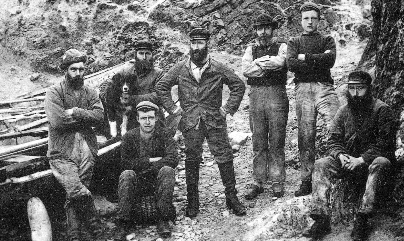
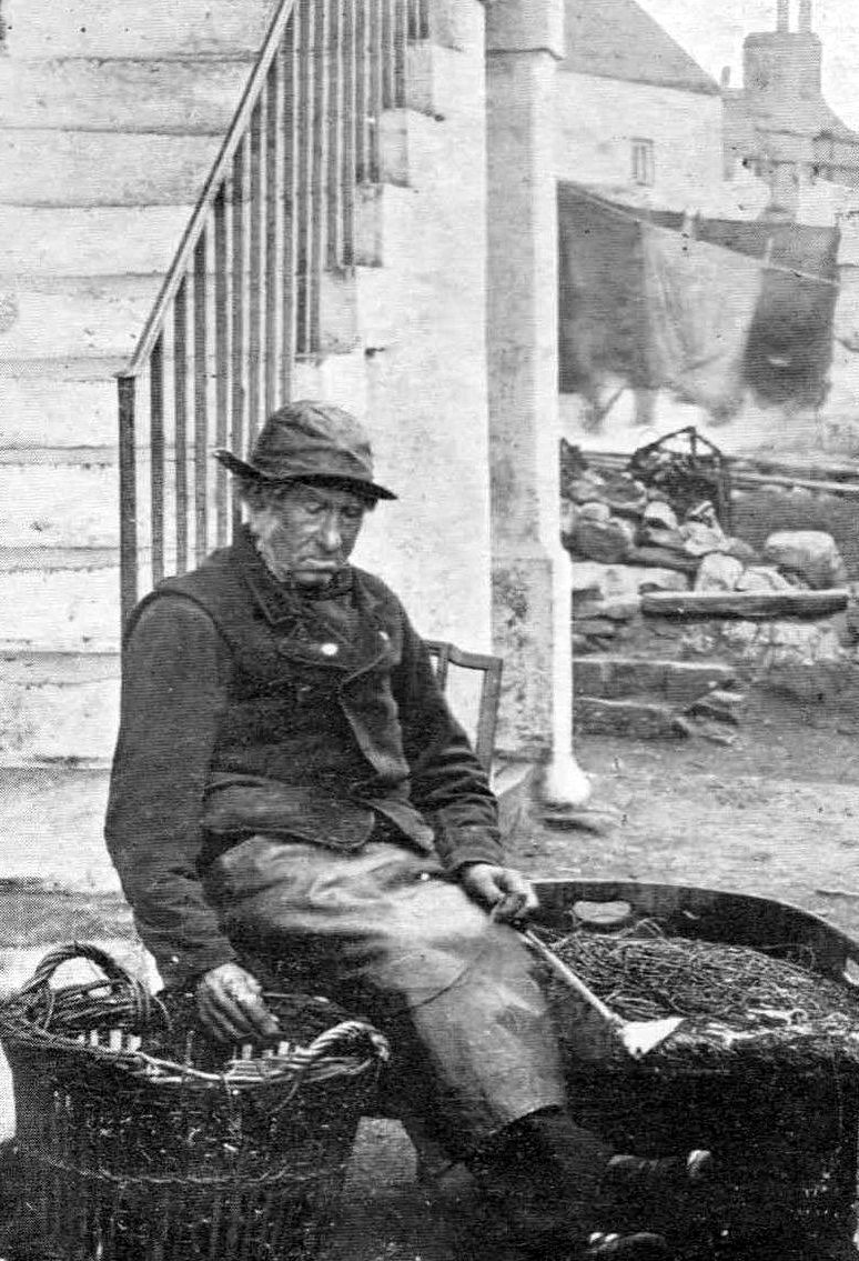
In these examples, we're using a landscape-oriented image (left) and a portrait-oriented image (right).
Solution #1: We're not setting height or width here; images appear at their natural size and are always centred and full width and height, so they fully cover their containing divs and the aspect ratio is preserved. The only issue is that if the image you're using is naturally very large, you may get more of a close-up than you want! See how close up we're seeing the fishermen on the left and the net-mending man on the right? It would be nice to get a broader look at them, wouldn't it? I mean, we're basically just looking at a guy's crotch in the first image.
Solution #2: The image styles are altered by a JS function that tests whether they are portrait or landscape orientation and applies specific styles to each through a class name. Seems great, right? But it's not truly responsive! Try narrowing the window until each image is very tall and thin. You'll see the image on the right start to get pretty squished. That's because the div containing the image is still width: 100% and min-height:100%, so the image is being stretched up to fit the height, but the width is being constrained. We'd see the same sort of effect with the landscape image on the left if we narrowed the container vertically.
Solution #3: Here, we're applying the CSS property "object-fit" to the images, with a value of "cover". Looks pretty good! You can even try narrowing the window to see if it squishes. It doesn't! It's the perfect solution, right? Not quite! It's supported in every browser but Internet Explorer and Edge (boo!), so it's not ideal. If only!