Grids Mashup
How do I make an grids mashup?
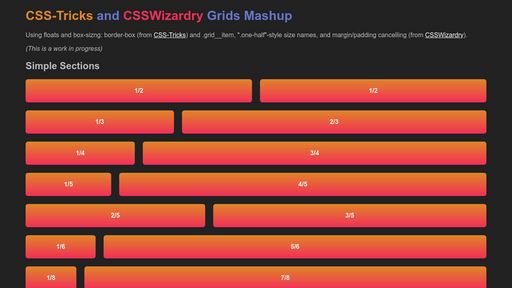
Taking pieces from both CSS-Tricks "Don't Over-think It Grids" and CSSWizardry Grids, to make my own mashup of a grid.. What is a grids mashup? How do you make a grids mashup? This script and codes were developed by Keith Wyland on 13 September 2022, Tuesday.

Grids Mashup - Script Codes HTML Codes
<!DOCTYPE html>
<html >
<head> <meta charset="UTF-8"> <title>Grids Mashup</title> <script src="https://s.codepen.io/assets/libs/modernizr.js" type="text/javascript"></script> <link rel="stylesheet" href="https://cdnjs.cloudflare.com/ajax/libs/normalize/5.0.0/normalize.min.css"> <style> /* NOTE: The styles were added inline because Prefixfree needs access to your styles and they must be inlined if they are on local disk! */ * { box-sizing: border-box;
}
.page-wrap { width: 90%; margin: 18px auto;
}
.grid { list-style: none; margin: 0 0 0 -20px; padding: 0; *zoom: 1;
}
.grid:before,
.grid:after { content: " "; display: table;
}
.grid:after { clear: both;
}
.grid__item { float: left; margin-bottom: 20px; padding-left: 20px; width: 100%;
}
/* gutterless, no spacing for full. extension of .grid, NOT .grid__item
So, <div class="grid grid--full"> ... */
.grid--full { margin-left: 0;
}
.grid--full > .grid__item { padding-left: 0;
}
/* center the .grid__items, extension of .grid */
.grid--center { text-align: center;
}
.grid--center > .grid__item { float: none; display: inline-block; text-align: left;
}
/* Sizes */
/* whole */
.one-whole { width: 100%;
}
/* half */
.one-half { width: 50%;
}
/* thirds */
.one-third { width: 33.333%;
}
.two-thirds { width: 66.666%;
}
/* quarter */
.one-quarter { width: 25%;
}
.three-quarters { width: 75%;
}
/* fifths */
.one-fifth { width: 20%;
}
.two-fifths { width: 40%;
}
.three-fifths { width: 60%;
}
.four-fifths { width: 80%;
}
/* sixths */
.one-sixth { width: 16.666%;
}
.five-sixths { width: 83.333%;
}
/* eighths */
.one-eighth { width: 12.5%;
}
.three-eighths { width: 37.5%;
}
.five-eighths { width: 62.5%;
}
.seven-eighths { width: 87.5%;
}
/* Demo stuff to show the grids */
.demo-block { background-color: #7788dd; background-image: linear-gradient(rgb(225, 135, 40), rgb(244, 48, 89)); border-radius: 6px; color: white; display: block; font-weight: bold; padding: 20px; text-align: center;
}
h1 { color: #6677cc; }
.csstricks { color: rgb(225, 135, 40);
}
.csswizardry { color: rgb(244, 48, 89);
}
body { background: #222; color: #bbb;
}
a { color: #fff;
} </style> <script src="https://cdnjs.cloudflare.com/ajax/libs/prefixfree/1.0.7/prefixfree.min.js"></script>
</head>
<body> <div class="page-wrap"> <h1><span class="csstricks">CSS-Tricks</span> and <span class="csswizardry">CSSWizardry</span> Grids Mashup</h1> <p>Using floats and box-sizng: border-box (from <a href="https://css-tricks.com/dont-overthink-it-grids/">CSS-Tricks</a>) and .grid__item, ".one-half"-style size names, and margin/padding cancelling (from <a href="https://csswizardry.com/csswizardry-grids/">CSSWizardry</a>).</p> <p><em>(This is a work in progress)</em></p> <h2>Simple Sections</h2> <div class="grid"> <div class="grid__item one-half"> <div class="demo-block">1/2</div> </div> <div class="grid__item one-half"> <div class="demo-block">1/2</div> </div> <div class="grid__item one-third"> <div class="demo-block">1/3</div> </div> <div class="grid__item two-thirds"> <div class="demo-block">2/3</div> </div> <div class="grid__item one-quarter"> <div class="demo-block">1/4</div> </div> <div class="grid__item three-quarters"> <div class="demo-block">3/4</div> </div> <div class="grid__item one-fifth"> <div class="demo-block">1/5</div> </div> <div class="grid__item four-fifths"> <div class="demo-block">4/5</div> </div> <div class="grid__item two-fifths"> <div class="demo-block">2/5</div> </div> <div class="grid__item three-fifths"> <div class="demo-block">3/5</div> </div> <div class="grid__item one-sixth"> <div class="demo-block">1/6</div> </div> <div class="grid__item five-sixths"> <div class="demo-block">5/6</div> </div> <div class="grid__item one-eighth"> <div class="demo-block">1/8</div> </div> <div class="grid__item seven-eighths"> <div class="demo-block">7/8</div> </div> <div class="grid__item three-eighths"> <div class="demo-block">3/8</div> </div> <div class="grid__item five-eighths"> <div class="demo-block">5/8</div> </div> </div> <h2>Full Grid (gutterless)</h2> <div class="grid grid--full"> <div class="grid__item one-quarter"> <div class="demo-block">1/4</div> </div> <div class="grid__item one-quarter"> <div class="demo-block">1/4</div> </div> <div class="grid__item one-quarter"> <div class="demo-block">1/4</div> </div> <div class="grid__item one-quarter"> <div class="demo-block">1/4</div> </div> <div class="grid__item one-third"> <div class="demo-block">1/3</div> </div> <div class="grid__item one-third"> <div class="demo-block">1/3</div> </div> <div class="grid__item one-third"> <div class="demo-block">1/3</div> </div> </div> <h2>Centered Grid Items </h2> <p><em>(Only works by using inline-block, no float, and HTML comment to remove added "inline" spacing. Not very cool, but might be OK for my use.)</em></p> <div class="grid grid--center"> <div class="grid__item three-eighths"> <div class="demo-block">3/8</div> </div><!-- --><div class="grid__item three-eighths"> <div class="demo-block">3/8</div> </div> </div> <h2>Nested Grids</h2> <div class="grid"> <div class="grid__item one-half"> <div class="grid"> <div class="grid__item one-half"> <div class="demo-block">1/2 (of 1/2)</div> </div> <div class="grid__item one-half"> <div class="demo-block">1/2 (of 1/2)</div> </div> </div> </div> <div class="grid__item one-half"> <div class="grid"> <div class="grid__item one-third"> <div class="demo-block">1/3 (of 1/2)</div> </div> <div class="grid__item two-thirds"> <div class="demo-block">2/3 (of 1/2)</div> </div> </div> </div> </div> <h2>Used on <ul></h2> <ul class="grid"> <li class="grid__item one-fifth"> <span class="demo-block">1/5 <li></span> </li> <li class="grid__item one-fifth"> <span class="demo-block">1/5 <li></span> </li> <li class="grid__item one-fifth"> <span class="demo-block">1/5 <li></span> </li> <li class="grid__item one-fifth"> <span class="demo-block">1/5 <li></span> </li> <li class="grid__item one-fifth"> <span class="demo-block">1/5 <li></span> </li> </ul>
</div> <script src='http://cdnjs.cloudflare.com/ajax/libs/jquery/2.1.3/jquery.min.js'></script>
</body>
</html>
Grids Mashup - Script Codes CSS Codes
* { box-sizing: border-box;
}
.page-wrap { width: 90%; margin: 18px auto;
}
.grid { list-style: none; margin: 0 0 0 -20px; padding: 0; *zoom: 1;
}
.grid:before,
.grid:after { content: " "; display: table;
}
.grid:after { clear: both;
}
.grid__item { float: left; margin-bottom: 20px; padding-left: 20px; width: 100%;
}
/* gutterless, no spacing for full. extension of .grid, NOT .grid__item
So, ... */
.grid--full { margin-left: 0;
}
.grid--full > .grid__item { padding-left: 0;
}
/* center the .grid__items, extension of .grid */
.grid--center { text-align: center;
}
.grid--center > .grid__item { float: none; display: inline-block; text-align: left;
}
/* Sizes */
/* whole */
.one-whole { width: 100%;
}
/* half */
.one-half { width: 50%;
}
/* thirds */
.one-third { width: 33.333%;
}
.two-thirds { width: 66.666%;
}
/* quarter */
.one-quarter { width: 25%;
}
.three-quarters { width: 75%;
}
/* fifths */
.one-fifth { width: 20%;
}
.two-fifths { width: 40%;
}
.three-fifths { width: 60%;
}
.four-fifths { width: 80%;
}
/* sixths */
.one-sixth { width: 16.666%;
}
.five-sixths { width: 83.333%;
}
/* eighths */
.one-eighth { width: 12.5%;
}
.three-eighths { width: 37.5%;
}
.five-eighths { width: 62.5%;
}
.seven-eighths { width: 87.5%;
}
/* Demo stuff to show the grids */
.demo-block { background-color: #7788dd; background-image: linear-gradient(rgb(225, 135, 40), rgb(244, 48, 89)); border-radius: 6px; color: white; display: block; font-weight: bold; padding: 20px; text-align: center;
}
h1 { color: #6677cc; }
.csstricks { color: rgb(225, 135, 40);
}
.csswizardry { color: rgb(244, 48, 89);
}
body { background: #222; color: #bbb;
}
a { color: #fff;
} 
Grids Mashup - Script Codes Developer Keith Wyland Username keithwyland Uploaded September 13, 2022 Rating 3 Size 3,960 Kb Views 22,264
Do you need developer help for Grids Mashup? Find the perfect freelance services for your business! Fiverr's mission is to change how the world works together. Fiverr connects businesses with freelancers offering digital services in 500+ categories. Find Developer!
Keith Wyland (keithwyland) Script Codes Name Size Order-changing Sidebar 4,100 Kb Check ... to CodePen 3,286 Kb Full Width Areas With Sidebar 2,709 Kb CSS Fan Blades or Flower 1,934 Kb Test bpopup ipad bug 7,924 Kb Signal 2,125 Kb Tunnel 1,983 Kb CSS Timer 3,208 Kb CSS Drawers 67,859 Kb Clock Concept 3,693 Kb
Create amazing marketing copy with AI! Jasper is the AI Content Generator that helps you and your team break through creative blocks to create amazing, original content 10X faster. Discover all the ways the Jasper AI Content Platform can help streamline your creative workflows. Start For Free!
Similar Scripts & Codes Name Username Size Elephants Full screen site Orrinward 3,981 Kb Video Player Custom Controls EleftheriaBatsou 3,665 Kb Responsive scrolling text Ashdurham 2,259 Kb Chuck Norris Background Manz 1,967 Kb Adding Items Valhead 4,008 Kb The Fantastic Mr Fox MalZiiirA 10,435 Kb Revolving Text Landing Page Trial TimRuby 2,976 Kb CSS3 Button Examples Volusion 3,377 Kb TheCalendar.js The-teacher 6,330 Kb CubeTronic Jurbank 3,716 Kb
Do you want hide your ip address? Surf anonymously, prevent hackers from acquiring your IP address, send anonymous email, and encrypt your Internet connection. High speed, ultra secure, and easy to use. Instant setup. Hide Your IP Now!
