Responsive full body border

Developer
Size
5,101 Kb
Views
30,360

How do I make an responsive full body border?

A responsive, full body border with cool looking headings.http://haydendmills.com/ . What is a responsive full body border? How do you make a responsive full body border? This script and codes were developed by Hayden Mills on 14 August 2022, Sunday.

Responsive full body border Previews

Responsive full body border - Script Codes HTML Codes

<!DOCTYPE html>
<html >
<head> <meta charset="UTF-8"> <title>Responsive full body border</title> <link rel="stylesheet" href="css/style.css">
</head>
<body> <head>	<!-- Basic Page Needs ================================================== -->	<meta charset="utf-8">	<title>Your Page Title Here :)</title>	<meta name="description" content="">	<meta name="author" content="">	<!-- Mobile Specific Metas ================================================== -->	<meta name="viewport" content="width=device-width, initial-scale=1, maximum-scale=1">	<!-- CSS ================================================== -->	<link rel="stylesheet" href="stylesheets/base.css">	<link rel="stylesheet" href="stylesheets/skeleton.css">	<link rel="stylesheet" href="stylesheets/layout.css">	<!--[if lt IE 9]>	<script src="http://html5shim.googlecode.com/svn/trunk/html5.js"></script>	<![endif]-->	<!-- Favicons	================================================== -->	<link rel="shortcut icon" href="images/favicon.ico">	<link rel="apple-touch-icon" href="images/apple-touch-icon.png">	<link rel="apple-touch-icon" sizes="72x72" href="images/apple-touch-icon-72x72.png">	<link rel="apple-touch-icon" sizes="114x114" href="images/apple-touch-icon-114x114.png">	<link href='http://fonts.googleapis.com/css?family=Montserrat' rel='stylesheet' type='text/css'>	<link href='http://fonts.googleapis.com/css?family=Open+Sans' rel='stylesheet' type='text/css'>
</head>
<body>
<div id="left"></div>
<div id="right"></div>
<div id="top"></div>
<div id="bottom"></div>
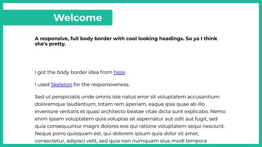
<div id="color1">	<h1 class="remove-bottom">Welcome</h1>
</div>	<div class="container">	<div class="sixteen columns">	<h4>A responsive, full body border with cool looking headings. So ya I think she's pretty.</h4>	<br></br>	<p>I got the body border idea from <a href="http://css-tricks.com/body-border/">here</a>.</p>	<p>I used <a href="http://www.getskeleton.com/">Skeleton</a> for the responsiveness.</p>	<p>Sed ut perspiciatis unde omnis iste natus error sit voluptatem accusantium doloremque laudantium, totam rem aperiam, eaque ipsa quae ab illo inventore veritatis et quasi architecto beatae vitae dicta sunt explicabo. Nemo enim ipsam voluptatem quia voluptas sit aspernatur aut odit aut fugit, sed quia consequuntur magni dolores eos qui ratione voluptatem sequi nesciunt. Neque porro quisquam est, qui dolorem ipsum quia dolor sit amet, consectetur, adipisci velit, sed quia non numquam eius modi tempora incidunt ut labore et dolore magnam aliquam quaerat voluptatem. Ut enim ad minima veniam, quis nostrum exercitationem ullam corporis suscipit laboriosam, nisi ut aliquid ex ea commodi consequatur? Quis autem vel eum iure reprehenderit qui in ea voluptate velit esse quam nihil molestiae consequatur, vel illum qui dolorem eum fugiat quo voluptas nulla pariatur?</p>	</div>	</div>
<div id="color2">	<h1 class="remove-bottom">Our mission</h1>
</div>	<div class="container">	<div class="sixteen columns">	<p>Sed ut perspiciatis unde omnis iste natus error sit voluptatem accusantium doloremque laudantium, totam rem aperiam, eaque ipsa quae ab illo inventore veritatis et quasi architecto beatae vitae dicta sunt explicabo. Nemo enim ipsam voluptatem quia voluptas sit aspernatur aut odit aut fugit, sed quia consequuntur magni dolores eos qui ratione voluptatem sequi nesciunt. Neque porro quisquam est, qui dolorem ipsum quia dolor sit amet, consectetur, adipisci velit, sed quia non numquam eius modi tempora incidunt ut labore et dolore magnam aliquam quaerat voluptatem. Ut enim ad minima veniam, quis nostrum exercitationem ullam corporis suscipit laboriosam, nisi ut aliquid ex ea commodi consequatur? Quis autem vel eum iure reprehenderit qui in ea voluptate velit esse quam nihil molestiae consequatur, vel illum qui dolorem eum fugiat quo voluptas nulla pariatur?</p>	</div>	</div>
<div id="color1">	<h1 class="remove-bottom">Our plan</h1>
</div>	<div class="container">	<div class="sixteen columns">	<p>Sed ut perspiciatis unde omnis iste natus error sit voluptatem accusantium doloremque laudantium, totam rem aperiam, eaque ipsa quae ab illo inventore veritatis et quasi architecto beatae vitae dicta sunt explicabo. Nemo enim ipsam voluptatem quia voluptas sit aspernatur aut odit aut fugit, sed quia consequuntur magni dolores eos qui ratione voluptatem sequi nesciunt. Neque porro quisquam est, qui dolorem ipsum quia dolor sit amet, consectetur, adipisci velit, sed quia non numquam eius modi tempora incidunt ut labore et dolore magnam aliquam quaerat voluptatem. Ut enim ad minima veniam, quis nostrum exercitationem ullam corporis suscipit laboriosam, nisi ut aliquid ex ea commodi consequatur? Quis autem vel eum iure reprehenderit qui in ea voluptate velit esse quam nihil molestiae consequatur, vel illum qui dolorem eum fugiat quo voluptas nulla pariatur?</p>	</div>	</div>
<div id="color2">	<h1 class="remove-bottom">Our team</h1>
</div>	<div class="container">	<div class="sixteen columns">	<p>Sed ut perspiciatis unde omnis iste natus error sit voluptatem accusantium doloremque laudantium, totam rem aperiam, eaque ipsa quae ab illo inventore veritatis et quasi architecto beatae vitae dicta sunt explicabo. Nemo enim ipsam voluptatem quia voluptas sit aspernatur aut odit aut fugit, sed quia consequuntur magni dolores eos qui ratione voluptatem sequi nesciunt. Neque porro quisquam est, qui dolorem ipsum quia dolor sit amet, consectetur, adipisci velit, sed quia non numquam eius modi tempora incidunt ut labore et dolore magnam aliquam quaerat voluptatem. Ut enim ad minima veniam, quis nostrum exercitationem ullam corporis suscipit laboriosam, nisi ut aliquid ex ea commodi consequatur? Quis autem vel eum iure reprehenderit qui in ea voluptate velit esse quam nihil molestiae consequatur, vel illum qui dolorem eum fugiat quo voluptas nulla pariatur?</p>	<br></br>	</div>	</div>
</body> <script src="js/index.js"></script>
</body>
</html>

Responsive full body border - Script Codes CSS Codes

@import url(http://fonts.googleapis.com/css?family=Montserrat:400,700);
#color2 h1{ color: #fff;
}
#top, #bottom, #left, #right {	background: #1abc9c;	position: fixed;	z-index: 1;	}	#left, #right {	top: 0; bottom: 0;	width: 15px;	}	#left { left: 0; }	#right { right: 0; }	#top, #bottom {	left: 0; right: 0;	height: 15px;	}	#top { top: 0; }	#bottom { bottom: 0; }
#color1{ background: #1abc9c; float: left; padding-left: 20%; padding-right: 50px; margin-bottom: 40px; margin-top: 40px;	-moz-border-radius: 5px; /* Firefox 3.6-, removed in Firefox 13 */	-webkit-border-radius: 5px; /* Safari 4-, Chrome 3- */	border-radius: 5px; /* Firefox 4+, Safari 5+, Chrome 4+, Opera 10.5+, IE9+ */
}
#color1 h1{ color: #fff;
}
#color2{	background: #1abc9c; float: right; padding-right: 20%; padding-left: 50px;margin-bottom: 40px;margin-top: 40px;	-moz-border-radius: 5px; /* Firefox 3.6-, removed in Firefox 13 */	-webkit-border-radius: 5px; /* Safari 4-, Chrome 3- */	border-radius: 5px; /* Firefox 4+, Safari 5+, Chrome 4+, Opera 10.5+, IE9+ */
}
html{ font-size: 24px; font-weight: 100; line-height: 1.5;
}
@media screen and (max-width: 900px){
html{ font-size: 20px;
}
}
@media screen and (max-width: 500px){ html{ font-size: 14px;
}
}
body{ font-family: 'Montserrat', sans-serif;
}
h1, h2, h3, h4, h5, h6, p, ul, ol{ margin-bottom: 1rem;
}
h1, h2, h3, h4, h5, h6{ margin-bottom: .5rem; margin-top: .5rem; line-height: 1.1;
}
/*
* Skeleton V1.2
* Copyright 2011, Dave Gamache
* www.getskeleton.com
* Free to use under the MIT license.
* http://www.opensource.org/licenses/mit-license.php
* 6/20/2012
*/
/* Table of Content
==================================================	#Site Styles	#Page Styles	#Media Queries	#Font-Face */
/* #Site Styles
================================================== */
/* #Page Styles
================================================== */
/* #Media Queries
================================================== */	/* Smaller than standard 960 (devices and browsers) */	@media only screen and (max-width: 959px) {}	/* Tablet Portrait size to standard 960 (devices and browsers) */	@media only screen and (min-width: 768px) and (max-width: 959px) {}	/* All Mobile Sizes (devices and browser) */	@media only screen and (max-width: 767px) {}	/* Mobile Landscape Size to Tablet Portrait (devices and browsers) */	@media only screen and (min-width: 480px) and (max-width: 767px) {}	/* Mobile Portrait Size to Mobile Landscape Size (devices and browsers) */	@media only screen and (max-width: 479px) {}
/* #Font-Face
================================================== */
/*	This is the proper syntax for an @font-face file	Just create a "fonts" folder at the root,	copy your FontName into code below and remove	comment brackets */
/*	@font-face { font-family: 'FontName'; src: url('../fonts/FontName.eot'); src: url('../fonts/FontName.eot?iefix') format('eot'), url('../fonts/FontName.woff') format('woff'), url('../fonts/FontName.ttf') format('truetype'), url('../fonts/FontName.svg#webfontZam02nTh') format('svg'); font-weight: normal; font-style: normal; }
*/
/*
* Skeleton V1.2
* Copyright 2011, Dave Gamache
* www.getskeleton.com
* Free to use under the MIT license.
* http://www.opensource.org/licenses/mit-license.php
* 6/20/2012
*/
/* Table of Contents
================================================== #Base 960 Grid #Tablet (Portrait) #Mobile (Portrait) #Mobile (Landscape) #Clearing */
/* #Base 960 Grid
================================================== */ .container { position: relative; width: 960px; margin: 0 auto; padding: 0; } .container .column, .container .columns { float: left; display: inline; margin-left: 10px; margin-right: 10px; } .row { margin-bottom: 20px; } /* Nested Column Classes */ .column.alpha, .columns.alpha { margin-left: 0; } .column.omega, .columns.omega { margin-right: 0; } /* Base Grid */ .container .one.column, .container .one.columns { width: 40px; } .container .two.columns { width: 100px; } .container .three.columns { width: 160px; } .container .four.columns { width: 220px; } .container .five.columns { width: 280px; } .container .six.columns { width: 340px; } .container .seven.columns { width: 400px; } .container .eight.columns { width: 460px; } .container .nine.columns { width: 520px; } .container .ten.columns { width: 580px; } .container .eleven.columns { width: 640px; } .container .twelve.columns { width: 700px; } .container .thirteen.columns { width: 760px; } .container .fourteen.columns { width: 820px; } .container .fifteen.columns { width: 880px; } .container .sixteen.columns { width: 940px; } .container .one-third.column { width: 300px; } .container .two-thirds.column { width: 620px; } /* Offsets */ .container .offset-by-one { padding-left: 60px; } .container .offset-by-two { padding-left: 120px; } .container .offset-by-three { padding-left: 180px; } .container .offset-by-four { padding-left: 240px; } .container .offset-by-five { padding-left: 300px; } .container .offset-by-six { padding-left: 360px; } .container .offset-by-seven { padding-left: 420px; } .container .offset-by-eight { padding-left: 480px; } .container .offset-by-nine { padding-left: 540px; } .container .offset-by-ten { padding-left: 600px; } .container .offset-by-eleven { padding-left: 660px; } .container .offset-by-twelve { padding-left: 720px; } .container .offset-by-thirteen { padding-left: 780px; } .container .offset-by-fourteen { padding-left: 840px; } .container .offset-by-fifteen { padding-left: 900px; }
/* #Tablet (Portrait)
================================================== */ /* Note: Design for a width of 768px */ @media only screen and (min-width: 768px) and (max-width: 959px) { .container { width: 768px; } .container .column, .container .columns { margin-left: 10px; margin-right: 10px; } .column.alpha, .columns.alpha { margin-left: 0; margin-right: 10px; } .column.omega, .columns.omega { margin-right: 0; margin-left: 10px; } .alpha.omega { margin-left: 0; margin-right: 0; } .container .one.column, .container .one.columns { width: 28px; } .container .two.columns { width: 76px; } .container .three.columns { width: 124px; } .container .four.columns { width: 172px; } .container .five.columns { width: 220px; } .container .six.columns { width: 268px; } .container .seven.columns { width: 316px; } .container .eight.columns { width: 364px; } .container .nine.columns { width: 412px; } .container .ten.columns { width: 460px; } .container .eleven.columns { width: 508px; } .container .twelve.columns { width: 556px; } .container .thirteen.columns { width: 604px; } .container .fourteen.columns { width: 652px; } .container .fifteen.columns { width: 700px; } .container .sixteen.columns { width: 748px; } .container .one-third.column { width: 236px; } .container .two-thirds.column { width: 492px; } /* Offsets */ .container .offset-by-one { padding-left: 48px; } .container .offset-by-two { padding-left: 96px; } .container .offset-by-three { padding-left: 144px; } .container .offset-by-four { padding-left: 192px; } .container .offset-by-five { padding-left: 240px; } .container .offset-by-six { padding-left: 288px; } .container .offset-by-seven { padding-left: 336px; } .container .offset-by-eight { padding-left: 384px; } .container .offset-by-nine { padding-left: 432px; } .container .offset-by-ten { padding-left: 480px; } .container .offset-by-eleven { padding-left: 528px; } .container .offset-by-twelve { padding-left: 576px; } .container .offset-by-thirteen { padding-left: 624px; } .container .offset-by-fourteen { padding-left: 672px; } .container .offset-by-fifteen { padding-left: 720px; } }
/* #Mobile (Portrait)
================================================== */ /* Note: Design for a width of 320px */ @media only screen and (max-width: 767px) { .container { width: 300px; } .container .columns, .container .column { margin: 0; } .container .one.column, .container .one.columns, .container .two.columns, .container .three.columns, .container .four.columns, .container .five.columns, .container .six.columns, .container .seven.columns, .container .eight.columns, .container .nine.columns, .container .ten.columns, .container .eleven.columns, .container .twelve.columns, .container .thirteen.columns, .container .fourteen.columns, .container .fifteen.columns, .container .sixteen.columns, .container .one-third.column, .container .two-thirds.column { width: 300px; } /* Offsets */ .container .offset-by-one, .container .offset-by-two, .container .offset-by-three, .container .offset-by-four, .container .offset-by-five, .container .offset-by-six, .container .offset-by-seven, .container .offset-by-eight, .container .offset-by-nine, .container .offset-by-ten, .container .offset-by-eleven, .container .offset-by-twelve, .container .offset-by-thirteen, .container .offset-by-fourteen, .container .offset-by-fifteen { padding-left: 0; } }
/* #Mobile (Landscape)
================================================== */ /* Note: Design for a width of 480px */ @media only screen and (min-width: 480px) and (max-width: 767px) { .container { width: 420px; } .container .columns, .container .column { margin: 0; } .container .one.column, .container .one.columns, .container .two.columns, .container .three.columns, .container .four.columns, .container .five.columns, .container .six.columns, .container .seven.columns, .container .eight.columns, .container .nine.columns, .container .ten.columns, .container .eleven.columns, .container .twelve.columns, .container .thirteen.columns, .container .fourteen.columns, .container .fifteen.columns, .container .sixteen.columns, .container .one-third.column, .container .two-thirds.column { width: 420px; } }
/* #Clearing
================================================== */ /* Self Clearing Goodness */ .container:after { content: "\0020"; display: block; height: 0; clear: both; visibility: hidden; } /* Use clearfix class on parent to clear nested columns, or wrap each row of columns in a 
*/ .clearfix:before, .clearfix:after, .row:before, .row:after { content: '\0020'; display: block; overflow: hidden; visibility: hidden; width: 0; height: 0; } .row:after, .clearfix:after { clear: both; } .row, .clearfix { zoom: 1; } /* You can also use a
to clear columns */ .clear { clear: both; display: block; overflow: hidden; visibility: hidden; width: 0; height: 0; }

Responsive full body border - Script Codes JS Codes

//http://haydendmills.com/
Responsive full body border - Script Codes
Home Page Home
Developer Hayden Mills
Username haydenmills
Uploaded August 14, 2022
Rating 3.5
Size 5,101 Kb
Views 30,360
Do you need developer help for Responsive full body border?

Find the perfect freelance services for your business! Fiverr's mission is to change how the world works together. Fiverr connects businesses with freelancers offering digital services in 500+ categories. Find Developer!

Hayden Mills (haydenmills) Script Codes
Create amazing blog posts with AI!

Jasper is the AI Content Generator that helps you and your team break through creative blocks to create amazing, original content 10X faster. Discover all the ways the Jasper AI Content Platform can help streamline your creative workflows. Start For Free!